Creating simple DAGs with Networkx
Nov 11 2023
Use basic coding skills to create pretty network graphs!
This blog post expects that the reader has some experience with Python.
Any time a data engineer hears the word “visualization” or “dashboard” fear instantly sets in. However, sometimes a basic visualization or chart is the best way to convey or explain an idea.
Imagine trying to explain a highly complex data pipeline, in which there are many dependencies and steps, without the help of visual aids. I’m sure all of us would agree that it is easier to explain and to understand something with a picture of it in front of you.
Thus, we can use networkx and matplotlib in Python to create some pretty cool dependency maps and DAGs for pipelines. If you’re unfamiliar with DAGs, read about them here.
I have embedded all relevant snippets of code to this blog post, but if you’d prefer the Github repository, feel free to clone it here.
Dependency maps
First off, you’ll want to make sure you are using at least Python 3 and install the following packages using pip or requirements.txt in the repository:
pip install matplotlib
pip install networkx
pip install requests
Once you’ve done that, let’s go ahead and create some dummy data using a wordbank and the requests library:
import networkx as nx
import matplotlib.pyplot as plt
import random
import requests

# get random work bank
word_site = "https://www.mit.edu/~ecprice/wordlist.10000"

response = requests.get(word_site)
words = response.content.splitlines()

# convert byte into string
words = [word.decode() for word in words]
After sending out your request, you’ll receive a list full of 10,000 words that you can choose from. Below is an example of the output of your words object:
>>> words
['a', 'aa', 'aaa', 'aaron', 'ab', ...]
We will be using the random library to randomly choose some words to create a data structure, simulating what some dependencies would look like if they were to be materialized as a data object in Python:
# append .csv for file-like names
files = [random.choice(words)+'.csv' for i in range(0,4)]

# create data structure for dependencies
dictionary = {}
for file in files:
    dictionary[file] = [random.choice(words) for i in range(0,2)]
Below is an example of the output of the dictionary object in which the dictionary key is your file and its dependencies are a list of tags for each file. Remember that we are using random to choose our words, so your output will most likely look different than mine. Conceptually, we can think of the items in the list as tags for each file, or its dependencies/children, where adaptor.csv has child tags expanding and beat, and so on:
>>> dictionary
{'adaptor.csv': ['expanding', 'beat'], 'playing.csv': ['cup', 'personality'], 'unable.csv': ['garlic', 'periodic'], 'mortgages.csv': ['hazards', 'requests']}
From there, let’s create our graph using Networkx, while also adding an additional layer of dependencies for complexity. Remember that edges (links) represent a relationship between nodes (objects):
# create our edge nodes according to our data structure
G = nx.DiGraph()
for files,tags in dictionary.items(): # iterating through dictionary items
    for tag in tags:
        G.add_edge(tag,files) # creating relationship between tag and files in our graph
        G.add_edge(random.choice(words),tag) # adding one more layer of dependencies
Once we have the basic graph structure fleshed out, we can now visualize our graph with the help of networkx and matplotlib:
# prettying it up
pos = nx.spring_layout(G,k=0.4)
args = dict(node_size=400,alpha=0.4,font_size=8,with_labels=True,node_color='b')
nx.draw(G, pos, **args)
plt.savefig('G.png',format='PNG') # saving figure to use picture later
plt.show()
plt.clf() # this closes the graph
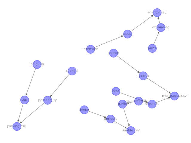
When I ran the code above, this is the image that was generated:

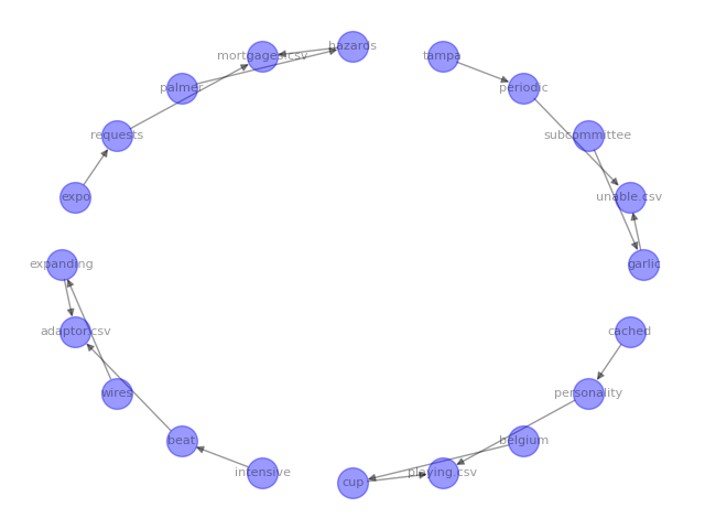
The arrows represent edges and the circles are nodes. We can now see all of our parent files and child tags visually represented. However, the graph is a little hard to read because of the layout. networkx provides different layouts that you can use depending on how you want to structure your visual graph:
# shell graph
pos = nx.shell_layout(G)
args = dict(node_size=400,alpha=0.4,font_size=8,with_labels=True,node_color='b')
nx.draw(G, pos, **args)
plt.savefig('G_shell.png',format='PNG') # saving figure to use picture later
plt.show()
plt.clf() # this closes the graph
The code above produced the following image:

Play around with the different layouts and visual parameters in the networkx documentation to best help you in getting whatever point across to your colleagues or stakeholders.
DAGs
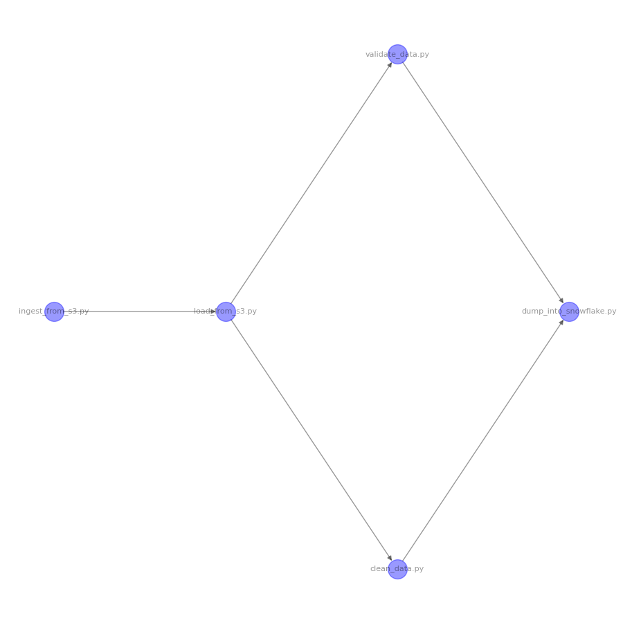
Now, let’s say you have a pipeline and want to create a visual DAG. We can easily create a DAG using Networkx. First, let’s create our DiGraph object and create our nodes and edges simulating what a pipeline might look like:
G = nx.DiGraph()
G.add_node('ingest_from_s3.py')
G.add_edge('ingest_from_s3.py','load_from_s3.py')
G.add_edge('load_from_s3.py','validate_data.py')
G.add_edge('load_from_s3.py','clean_data.py')
G.add_edge('clean_data.py','dump_into_snowflake.py')
G.add_edge('validate_data.py','dump_into_snowflake.py')
Now, let’s sort our nodes by using a topological sort to display our nodes in order of appearance and hierarchy:
for layer, nodes in enumerate(nx.topological_generations(G)):
    for node in nodes:
        G.nodes[node]["layer"] = layer

pos = nx.multipartite_layout(G, subset_key="layer")
From here, let’s pass in our parameters and create our graph:
args = dict(node_size=400,alpha=0.4,font_size=8,with_labels=True,node_color='b',arrows=True)
plt.figure(figsize=(9,9))
nx.draw(G, pos, **args)
plt.savefig('G_dag.png',format='PNG') # saving figure to use picture later
plt.show()
plt.clf() # this closes the graph
The above code produces the following image:

Boom! There you go. Who needs Canva and draw.io when you’ve got Networkx?